A picture worth 200 years
In just over a year, Maryville College will celebrate its 200 year history of ambitious social progress, bold educational advancements and ardent spiritual beginnings. This bicentennial milestone merits recognition, fanfare and even an iconic symbol representative of Maryville’s great legacy.
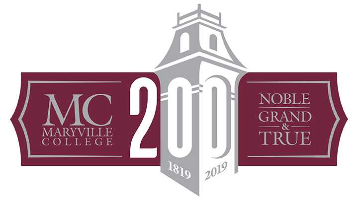
The bicentennial logo, created by the Visual Voice design firm, attempts to combine important aspects of Maryville College in an austere, clever image. Even the tag line which is “Noble, Grand and True” is taken from the 119-year-old Alma Mater.
“It’s impossible to summarize 200 years of history and impact in a logo and tagline, but I think we came pretty darn close,” said Karen Eldridge, the Maryville college alumna who spearheaded the creative project.
The logo itself is inspired by the preexisting “corporate” logo which includes a minimalistic image of Anderson Hall but incorporates the dates of Maryville’s existence and the number 200 in a stylistic way.
“Our tower logo already has a lot of recognition in the external community,” Eldridge said. “Building on that recognition felt like the right thing to do.”
Response to the new logo has been largely positive from faculty and students alike, yet there are dissenters.
Some believe the college should have used internal resources rather than an outside firm. The primary argument is that one of the design professors or marketing staff could have created an image of equal quality. One student even suggested that a college wide competition for the best logo would have been a financially frugal and inclusive alternative.
“An outside firm was used because new perspectives and fresh eyes would be valuable for the project,” Eldridge said.
Furthermore, the creation team behind the logo referenced an online survey that was taken by Maryville College alumni professors and students alike. This survey asked the participant what visuals and commonalities he or she associated with the college, and the logo’s design was based upon these responses.
In addition to the survey, Eldridge’s team also consulted Maryville marketing and communications staff saying that “their expertise and insight was crucial.”
When asked about the cost of the process she replied that it was incredibly “modest.” She seemed to feel that the image was worth the price and the time spent in its creation. The final version was conceived in less than a year with the process starting in late February of 2017, and the logo being finalized this October.
That may seem like a long amount of time to spend on a picture, but, to the creators, the logo is much more than just an image.
“The visual illustrates what we are and have always tried to be – an institution that does the right thing, has high standards and expectations, and remains committed to the things that last and really matter in this world,” said Eldridge.
This logo is a celebration of Maryville’s past but more importantly serves as a symbol of its continued future and bright progress. The college has already strived through two centuries, so what’s to say that in two more it won’t be an even greater institution of nobility and learning? The bicentennial logo attempts to ask that question.
Having accompanying visuals for any event is wise, yet this image is obviously special. Quite often is a picture worth a thousand words, but very rarely is one worth 200 years.